SVG 动画原来这么简单
SVG 线条动画一般都基于 stroke 的stroke-dasharray和stroke-dashoffset两个属性来实现。
先快速了解下这两个属性的作用。
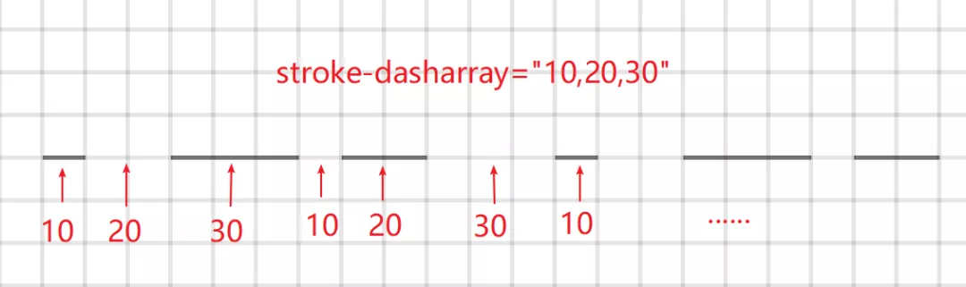
stroke-dasharray 主要用来实现虚线效果。属性值可以是一个数字,也可以是多个数(逗号隔开),百分数,负数无效。
stroke-dasharray: 10;
stroke-dasharray: 10, 20, 30;
如何理解属性值,基于官方的解释,这里说一下我觉得更容易理解的方式。
不管几个数,定义的数可以理解为一组,然后是不断重复的。比如上面的可以理解为:
stroke-dasharray: 10,10,10,10,10,10,10,10,10,10,10,10,...;
stroke-dasharray: 10,20,30, 10,20,30, 10,20,30, 10,20,30...;
奇数位置的数代表实线的长度,偶数位置的为虚线的长度。也就是第一个是实线的长度,第二个数是虚线的长度,第三个数是实线的长度......
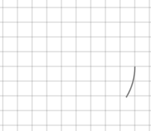
下面通过示例能更清晰理解。图中的背景为10*10的方块。

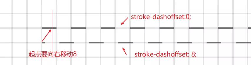
stroke-dashoffset 是绘制起点的偏移量。属性值可以是数字、负数,百分数。
stroke-dashoffset: 10;
stroke-dashoffset: -20;
stroke-dashoffset: 10%;
按照我们的经验去理解,正值就是向右偏移量,负值向左偏移量。
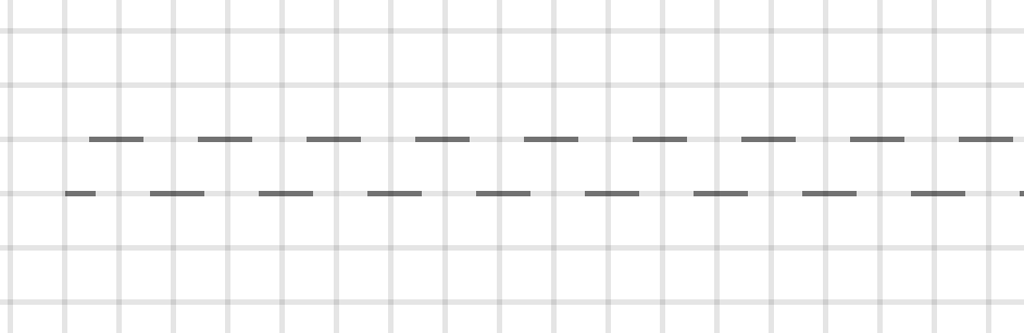
在浏览器中连续调整值可以非常清晰的看到其效果。
可以看到正值表现为向左移动,而负值则表现为向右移动,这个和我们理解刚好相反,之前看了网上各种文章对于这个解释的也不是很清楚,SVG标准文档里面甚至还有计算公式,都不能很好理解。
回到它的定义——绘制起点的偏移量,那么如果是正值,绘制起点需要向右移动对应的值,比如stroke-dashoffset: 8; 就是绘制起点向右移8,那么此时相对于 stroke-dashoffset: 0; 可以看做是把线条往后移动8,这也是为什么我们看到的效果是向左移动。
最后来说一下基于这两个属性怎么去做一些动画,其实上面视频中已经可以看到 stroke-dashoffset 的变化已经可以做出一些动画来。比如一条流动的虚线就可以非常简单的实现。
<line class="flow-right" x1="50" y1="40" x2="360" y2="40"
                  shape-rendering="crispEdges" stroke-dasharray="10"
                  style="stroke:rgb(0,0,0,.5);stroke-width:1" />

<line class="flow-left" x1="50" y1="50" x2="360" y2="50"
      shape-rendering="crispEdges" stroke-dasharray="10"
      style="stroke:rgb(0,0,0,.5);stroke-width:1" />
.flow-right {
    stroke-dashoffset: -20;
    animation: flow 1s linear infinite;
}
 .flow-left {
    stroke-dashoffset: 20;
    animation: flow 1s linear infinite;
}

@keyframes flow {
    to {
        stroke-dashoffset: 0;
    }
}
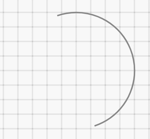
用在圆环上,可以很方便实现一个 loading效果
<circle class="circle" cx="100" cy="150" r="40" stroke="#888"
                    stroke-dasharray="125" stroke-width="1" fill="none" />
<style>
.circle {
    stroke-dashoffset: 250;
    animation: circle 1s linear infinite;
}
@keyframes circle {
    to {
        stroke-dashoffset: 0;
    }
}
</style>
使用 stroke-dasharray 可以快速实现环形进度的效果。
<circle class="progress" cx="200" cy="150" r="40" stroke="#888"
                    stroke-width="1" fill="none" />
<style>
.progress {
    stroke-dasharray: 0,250;
    animation: progress 10s linear infinite;
}
@keyframes progress {
    to {
        stroke-dasharray: 250,0;
    }
}
</style>
两个属性组合还可以做出更多的效果。
当然使用 CSS 在IE兼容性有一定问题,如果不考虑IE的兼容性问题,还是一个实现SVG动画的不错的选择。