纯CSS实现三角形阴影效果
原创
2022-10-19
09:06
编辑于
2022-10-19
10:06
矩形旋转方案
使用伪元素来实现,实现效果如下。这种方案的好处就是兼容性好,阴影的效果可以和外层元素的阴影效果贴合。
#box {
        width: 200px;
        height: 100px;
        box-shadow: 0 0px 8px 0 rgba(0,0,0, 0.3);
        position: relative;
}

#box::before {
        position: absolute;
        bottom: 0;
        left: 50%;
        content: '';
        transform: translateX(-50%);
        width: 30px;
        height: 18px;
        background: #fff;
        z-index: 1;
}

#box::after {
        position: absolute;
        bottom: -6px;
        left: 50%;
        content: '';
        width: 16px;
        height: 16px;
        background: #fff;
        transform: translateX(-50%) rotate(45deg);
        box-shadow: 0 0px 8px 0 rgba(0,0,0, 0.3);
}
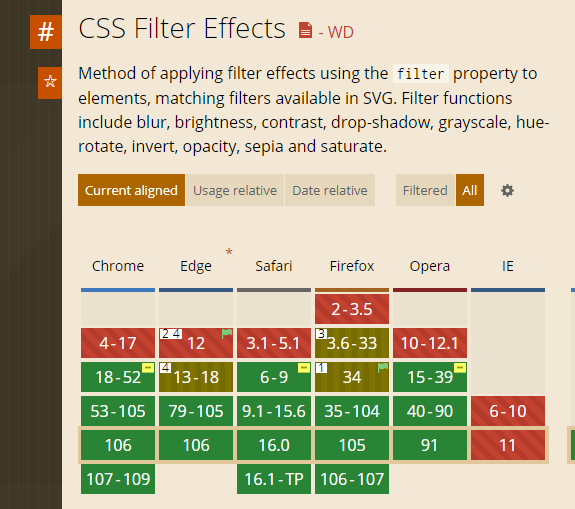
drop-shadow 实现
使用 filter 的 drop-shadow 实现,相比上面的方案,只需要一个伪元素就可以实现,而且可以使用border来实现三角形,缺点是兼容性不是很好,IE系不支持。效果如下。
<div id="box1"></div>
<style>
#box1 {
        width: 200px;
        height: 100px;
        box-shadow: 0 0px 8px 0 rgba(0, 0, 0, 0.3);
        position: relative;
}

#box1::before {
        position: absolute;
        content: '';
        bottom: -12px;
        left: 50%;
        transform: translateX(-50%);
        width: 0;
        height: 0;
        border-style: solid;
        border-width: 12px 12px 0 12px;
        border-color: #fff transparent transparent transparent;
        -webkit-filter: drop-shadow(1px 1px 1px rgba(0, 0, 0, .3));
        filter: drop-shadow(1px 1px 1px rgba(0, 0, 0, .3));
}
</style>
filter 兼容性如下图。
转载请注明出处。本文地址:
https://www.qinshenxue.com/article/pure-css-to-achieve-the-triangle-shadow-effect.html

关注我的公众号