不到180行代码写了一个漂亮的网页翻页时钟
原创
2024-8-12
10:12
编辑于
2024-8-12
10:19
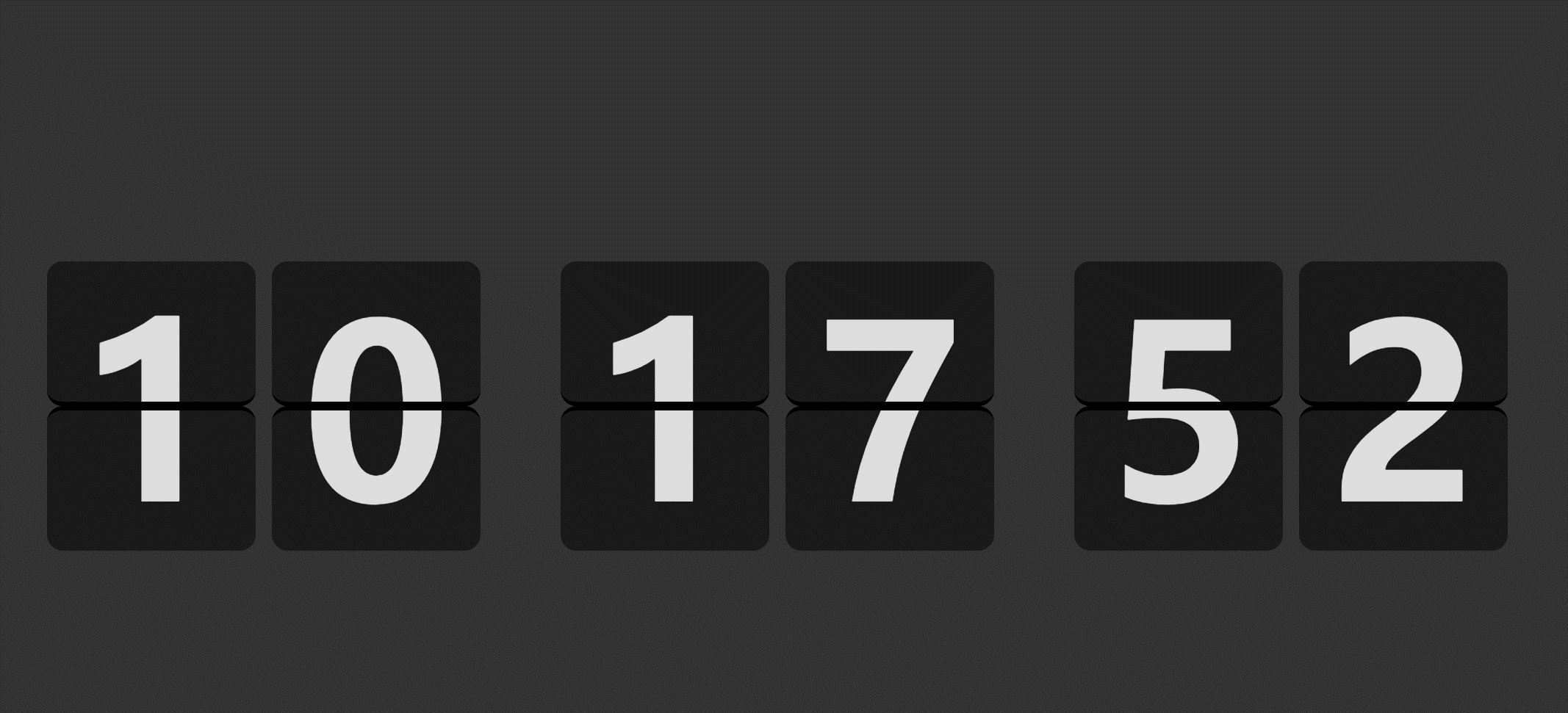
先看效果
写这个翻页时钟涉及的核心知识点主要集中在CSS,主要包括以下知识点:
- perspective: var(--col-height);
- backface-visibility: hidden;
- transform-style: preserve-3d;
- content: attr(data-t);
后续会出一篇详细的文章讲解如何实现这个翻页时钟。
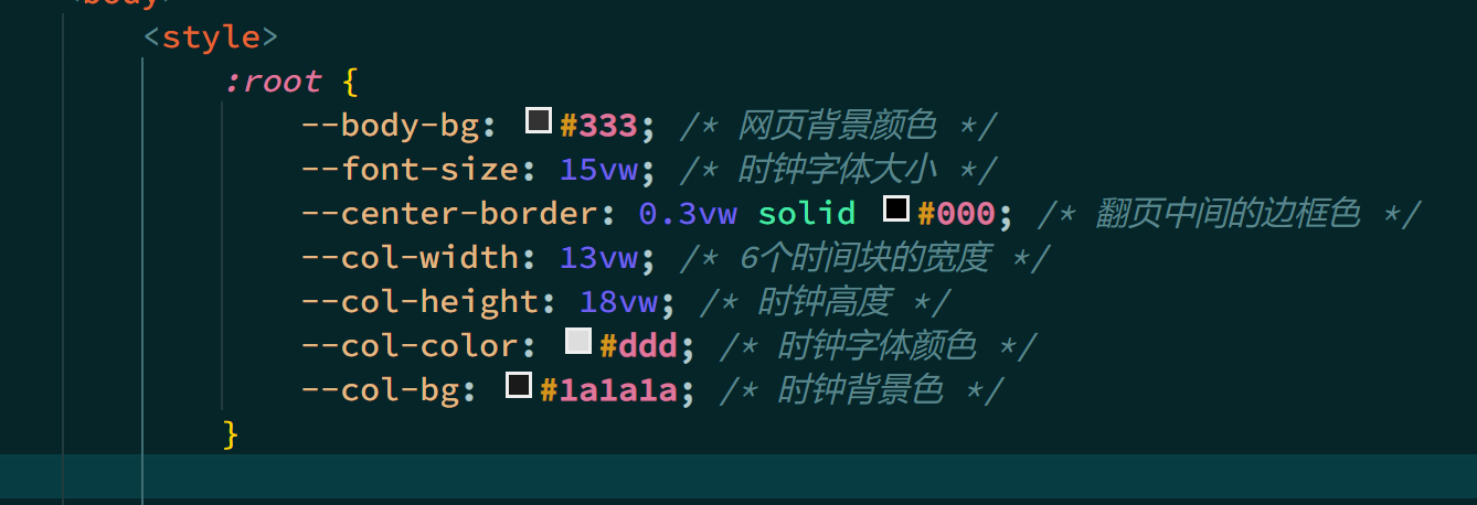
所有单位都是基于vw的,也就是网页的宽度,因此整体是响应式的,小屏也能完整显示,只是字体相对较小,效果差点儿。个性化配置抽取为CSS变量,方便个性化配置。
所有源码如下,新建一个html文件,粘贴以下代码,打开html文件就可以看到效果了,或者在电脑上打开原文链接地址拷贝更方便。
<style>
    :root {
        --body-bg: #333; /* 网页背景颜色 */
        --font-size: 15vw; /* 时钟字体大小 */
        --center-border: 0.3vw solid #000; /* 翻页中间的边框色 */
        --col-width: 13vw; /* 6个时间块的宽度 */
        --col-height: 18vw; /* 时钟高度 */
        --col-color: #ddd; /* 时钟字体颜色 */
        --col-bg: #1a1a1a; /* 时钟背景色 */
    }

    body {
        background-color: var(--body-bg);
    }

    .time {
        position: absolute;
        inset: 0;
        justify-content: center;
        align-items: center;
        display: flex;
        gap: 1vw;
        font-family: sans-serif;
        font-weight: 700;
        overflow: hidden;
    }

    .col {
        width: var(--col-width);
        height: var(--col-height);
        perspective: var(--col-height);
    }
    .col:nth-child(3),
    .col:nth-child(5) {
        margin-left: 4vw;
    }

    .curr,
    .next {
        position: relative;
        width: var(--col-width);
        height: calc(var(--col-height) / 2);
        font-size: var(--font-size);
        background: var(--col-bg);
        border-radius: 1vw;
        color: var(--col-color);
        overflow: hidden;
        box-sizing: border-box;
    }

    .flip .curr::before,
    .flip .next::before,
    .col > .curr::before,
    .col > .next::before {
        position: absolute;
        content: attr(data-t);
        line-height: var(--col-height);
        text-align: center;
        height: var(--col-height);
        left: 0;
        right: 0;
    }

    .flip .curr::before,
    .col > .next::before {
        top: 0;
    }

    .flip .next::before,
    .col > .curr::before {
        bottom: 0;
    }

    .flip .curr,
    .col > .next {
        border-bottom: var(--center-border);
    }

    .flip .next,
    .col > .curr {
        border-top: var(--center-border);
    }

    .flip .next {
        transform: rotateX(-180deg);
        backface-visibility: hidden;
    }

    .flip .curr {
        position: absolute;
        top: 0;
        backface-visibility: hidden;
    }

    .flip {
        position: absolute;
        width: var(--col-width);
        height: var(--col-height);
        z-index: 1;
        transform-style: preserve-3d;
        transition: transform 0s;
        transform: rotateX(0);
    }

    .flip.active {
        transition: all 0.5s ease-in-out;
        transform: rotateX(-180deg);
    }
</style>
<div class="time" id="time"></div>
<script>
    const colElms = [];

    function getTimeStr(date = new Date()) {
        return [date.getHours(), date.getMinutes(), date.getSeconds()]
            .map((item) => item.toString().padStart(2, "0"))
            .join("");
    }

    function createCol() {
        const createEl = (cls) => {
            const div = document.createElement("div");
            div.classList.add(cls);
            return div;
        };
        const [col, flip, flipNext, flipCurr, next, curr] = ["col", "flip", "next", "curr", "next", "curr"].map(
            (cls) => createEl(cls)
        );
        flip.append(flipNext, flipCurr);
        col.append(flip, next, curr);
        time.append(col);
        return {
            toggleActive: () => flip.classList.toggle("active"),
            getCurr: () => curr.dataset.t,
            setCurr: (t) => [flipCurr, curr].forEach((el) => (el.dataset.t = t)),
            setNext: (t) => [flipNext, next].forEach((el) => (el.dataset.t = t)),
        };
    }

    for (let i = 0; i < 6; i++) {
        colElms.push(createCol());
    }

    const timeStr = getTimeStr();
    colElms.forEach(({ setCurr }, i) => {
        setCurr(timeStr[i]);
    });

    let lastSec = new Date().getSeconds();
    function updateTime() {
        let s = new Date().getSeconds();
        if (s === lastSec) {
            return;
        }
        lastSec = s;
        const currStr = getTimeStr();
        colElms.forEach(({ toggleActive, getCurr, setCurr, setNext }, i) => {
            var currTxt = getCurr();
            setNext(currStr[i]);
            if (currTxt !== currStr[i]) {
                toggleActive();
                setTimeout(() => {
                    toggleActive();
                    setCurr(currStr[i]);
                }, 500);
            }
        });
    }

    function run() {
        updateTime();
        setTimeout(() => {
            run();
        }, 1000 / 60);
    }

    run();
</script>
转载请注明出处。本文地址:
https://www.qinshenxue.com/article/less-than-180-lines-of-code-write-a-beautiful-web-page-turning-clock.html

关注我的公众号