快速了解 CSS 网格布局
原创
2020-3-22
11:03
编辑于
2022-6-17
15:44
网格布局(display:grid 或 display:inline-grid)关联的 CSS 属性如下。
| 属性 | 说明 | 属性值 |
|---|---|---|
| grid-template-columns | 定义列的数量及宽度 | 绝对单位、%、fr、repeat、auto、minmax |
| grid-template-rows | 定义行的高度 | 绝对单位、%、fr、repeat、auto、minmax |
| grid-template-areas | 划分区域,给区域命名 | - |
| grid-template | 上面三个属性的合并简写 | - |
| grid-auto-rows | grid-template-rows只能定义有限数量行的高度, 比如定义了3行的行高,那么grid-auto-rows可以定义3行以后所有行的高度 |
- |
| grid-auto-columns | 设定grid-template-columns之外的列的宽度 | - |
| grid-column-gap | 列与列的间距 | 绝对单位、% |
| grid-row-gap | 行与行的间距 | 绝对单位、% |
| grid-gap | grid-row-gap和grid-column-gap合并的简写,grid-column-gap 省略的话,则认为其等于 grid-row-gap | 绝对单位、% |
| grid-auto-flow | grid 单元格排列顺序 | row、column、row dense、column dense |
| justify-items | grid 单元格的内容区域在单元格内的水平位置 | start、end、center、stretch |
| align-items | grid 单元格的内容区域在单元格内的垂直位置 | start、end、center、stretch |
| place-items | align-items 和 justify-items合并的简写,justify-items省略的话,则认为和align-items的属性值一样 | - |
| justify-content | grid 内整个内容区域在grid内水平位置 | start、end、center、stretch、space-around、space-between、space-evenly |
| align-content | grid 内整个内容区域在grid内垂直位置 | start、end、center、stretch、space-around、space-between、space-evenly |
| place-content | align-content 和 justify-content合并的简写,省略规则同 place-items | - |
grid-template-columns 和 grid-template-rows
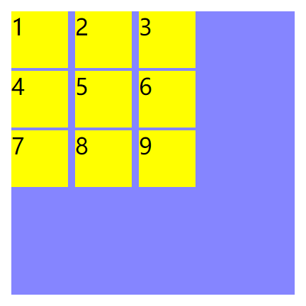
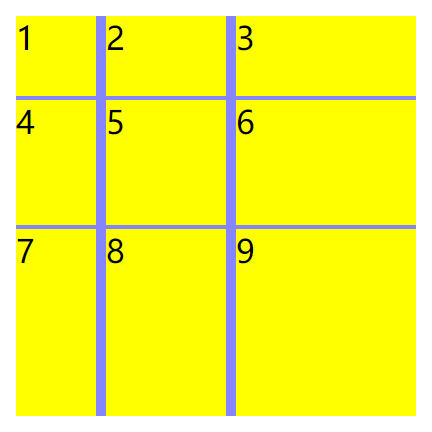
使用绝对单位定义一个 3*3 的网格
.grid-container {
    display: grid;
    width: 200px;
    height: 200px;
    background-color: #8585ff;
    grid-template-columns: 40px 40px 40px;
    grid-template-rows: 40px 40px 40px;
    grid-gap: 2px 5px;
}
.cell {
    background-color: #ff0;
}
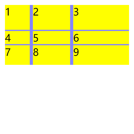
repeat可以解决重复定义相同的列或行。
grid-template-columns: repeat(3,40px)等同于grid-template-columns: 40px 40px 40pxgrid-template-columns: repeat(3,40px 20px)等同于grid-template-columns: 40px 20px 40px 20px 40px 20px
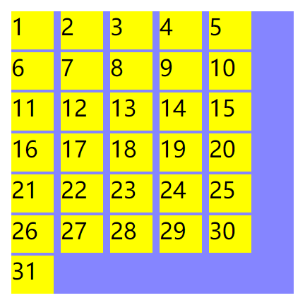
repeat 中可以使用 auto-fill,作用是尽可能填充每一行或每一列更多的单元格,直到不能放下为止。
.grid-container {
    display: grid;
    width: 200px;
    height: 200px;
    background-color: #8585ff;
    grid-template-columns: repeat(auto-fill, 30px);
    grid-gap: 2px 5px;
}
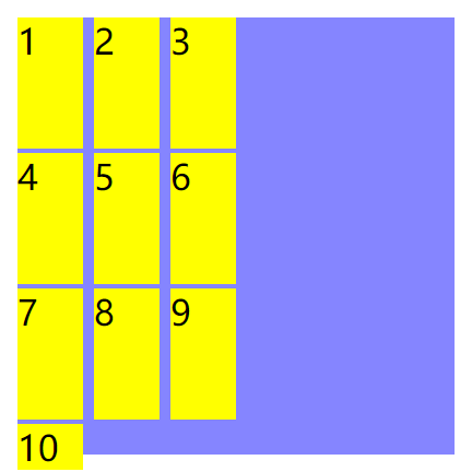
grid-template-rows 也可以使用 auto-fill,前提是设置了grid的高度,如果不设置grid的高度, 那么auto-fill只对第一行有效。
.grid-container {
    display: grid;
    width: 200px;
    height: 200px;
    background-color: #8585ff;
    grid-template-columns: 30px 30px 30px;
    grid-template-rows: repeat(auto-fill, 60px);
    grid-gap: 2px 5px;
}
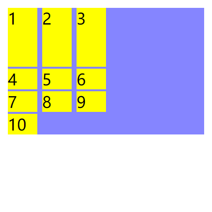
去掉grid的高度。
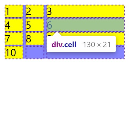
fr用于元素的比例关系。使用 fr 则会填充整个宽度或高度,填充高度则需要定义了grid的高,否则fr以容器自身的高度。
.grid-container {
    display: grid;
    width: 200px;
    height: 200px;
    background-color: #8585ff;
    grid-template-columns: 40px 2fr 3fr;
    grid-template-rows: 40px 2fr 3fr;
    grid-gap: 2px 5px;
}
去掉grid的高度。则fr是内容的高度。
minmax 则是单元格宽度或高度的一个范围。
.grid-container {
    display: grid;
    width: 200px;
    background-color: #8585ff;
    grid-template-columns: 30px 30px minmax(50px,200px);
    grid-gap: 2px 5px;
}
转载请注明出处。本文地址:
https://www.qinshenxue.com/article/css-display-grid.html

关注我的公众号